RIDER APP REDESIGN
For 9 months in 2017-2018, I was part of an ambitious cross-functional team effort for a complete redesign of the Lyft Rider app. It launched in June, 2018 and won both Material Design’s 2018 Innovation Award and Core77’s Notable Interaction Award.
I primarily led design for search improvements, the post-request experience, and increasing driver tips.
As Lyft went through hyper growth, I also created scalable design frameworks, built a Rider UI library, and wrote platform design guidelines for the rapidly expanding Design team to leverage.

My Role
Platforms: iOS, ANDROID
My responsibilities included user research, product strategy, aligning stakeholders on product goals, information architecture, designing user flows, visual design, interaction design, prototyping, user testing, quality assurance, and creating design guidelines.

Design Goals
Fast + Simple
Optimized for price/time comparison
Core actions are reachable and requesting a ride requires fewer taps
CONTEXTUAL
Surfaces the right recommendations for different times and places
Repeat rides are a breeze
WORKS FOR EVERYONE
Legible, accessible, and scales across devices and platforms
Accommodates future modes of transportation
Product goals
Ensure metrics parity between the control treatment and the redesign before rolling out to 100% of users on both platforms.
Continue to iterate and improve existing features. Validate UX changes with data.
Continue to work towards feature parity — feature parity is not a blocker for launch.
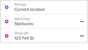
Step 1: Choose Destination
In the previous app design, you had to enter pickup and drop-off in 2 separate steps. There was no way to add a third stop before selecting a mode. You also could not re-order your destinations.

OLD: START TO FINISH
Previously, riders were asked to set their pickup location before selecting a destination. The default view was a search field, rather than a map view, so they were unable to see their GPS indicator and verify that their GPS location matched where they wanted to be picked up.

NeW: DESTINATION FIRST
Now, riders set their destination first, have the ability to add a stop, and confirm their pickup location on the map. Power riders can also bypass manually entering their destination by tapping a shortcut on the Home screen.


MY WORK:
Search UX/UI improvements, panel transitions, search field states and transitions, search recommendation logic improvements
MY TEAMMATES’ WORK:
Destination first flow, personalized home greetings, editable shortcuts, branded search results
SEARCH FIELD ANATOMY

SEARCH FIELD STATES
ERROR STATE TRANSITION
Step 2: Choose Mode
In the previous app design, you had to choose a mode first before entering your destination, and there was no easy way to compare price and time across modes. Riders would have to tap on their previously selected mode to pull up a second variation of the mode selector, updated to reflect price based on destination.

OLD: START TO FINISH
Previously, riders were asked to choose what type of car they preferred and set their pickup before choosing a destination. While this flow mapped to the mental model of inputting trip directions, Lyft was unable to provide riders with price and time information that would allow them to make the right choice for their immediate needs.

NeW: DESTINATION FIRST
Asking riders to set their destination first allows Lyft to expose real-time price estimates and ETAs, allowing easier comparison between transportation modes.


MY WORK:
Interaction pattern audit, mode selection and map transitions, UI polish
MY TEAMMATES’ WORK:
Multivariate experiments for mode content layout, integrating new modes, integrating scheduled rides and editing payment flows
Step 3: Confirm Pickup

MY WORK:
Drag pin on map interaction, panel & map transitions, UI polish
MY TEAMMATES’ WORK:
Pin visual and interaction refinement, walking indicators, far pickup detection, pickup notes
Step 4: Request Ride
The experience beyond selecting a mode and requesting a ride is what we referred to as the post-request experience. This became my primary area of focus as we worked tirelessly to achieve metrics parity between the control and the redesign. I designed a number of experiment variants for several features before landing on the versions that shipped.
Matching with a driver

MY WORK:
Panel framework, panel and map transitions for Classic Lyft, multivariate experiments to reduce cancels
MY TEAMMATES’ WORK:
Matching states for different modes, mode illustrations
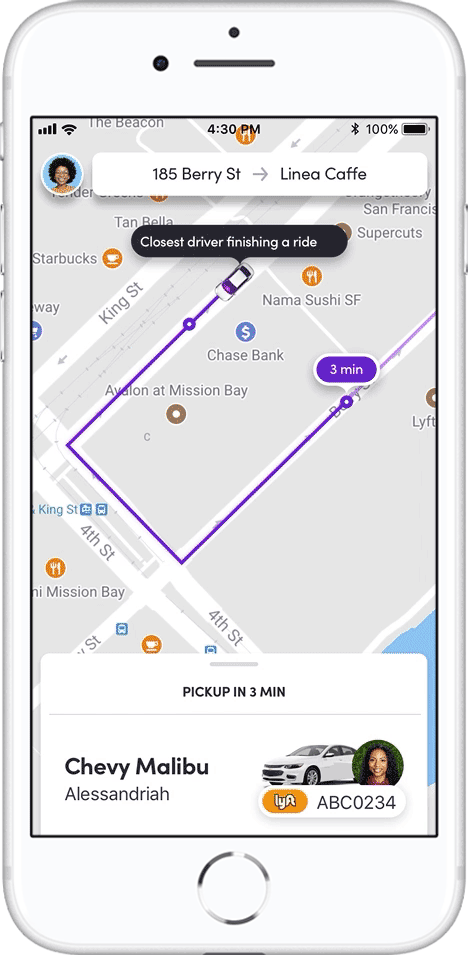
In Ride Panel
The In-Ride panel has 2 states, collapsed and expanded. The collapsed state displays only the information that is essential for a successful pickup. The expanded panel is where all other ride-related content lives. This distinction is important for preserving functional map real estate, so that riders are able to interact with the map as they are figuring out where to meet their driver.
MY WORK:
Panel framework, panel & map transitions, driver card
MY TEAMMATES’ WORK:
Trip & payment cards in the expanded panel
Panel guidelines
To support the needs of our rapidly expanding design team, I created design guidelines for an extensible panel framework, to enforce information hierarchy at critical moments in the post-request flow and preserve map functionality.

Ex: only primary and secondary cards are shown above the fold
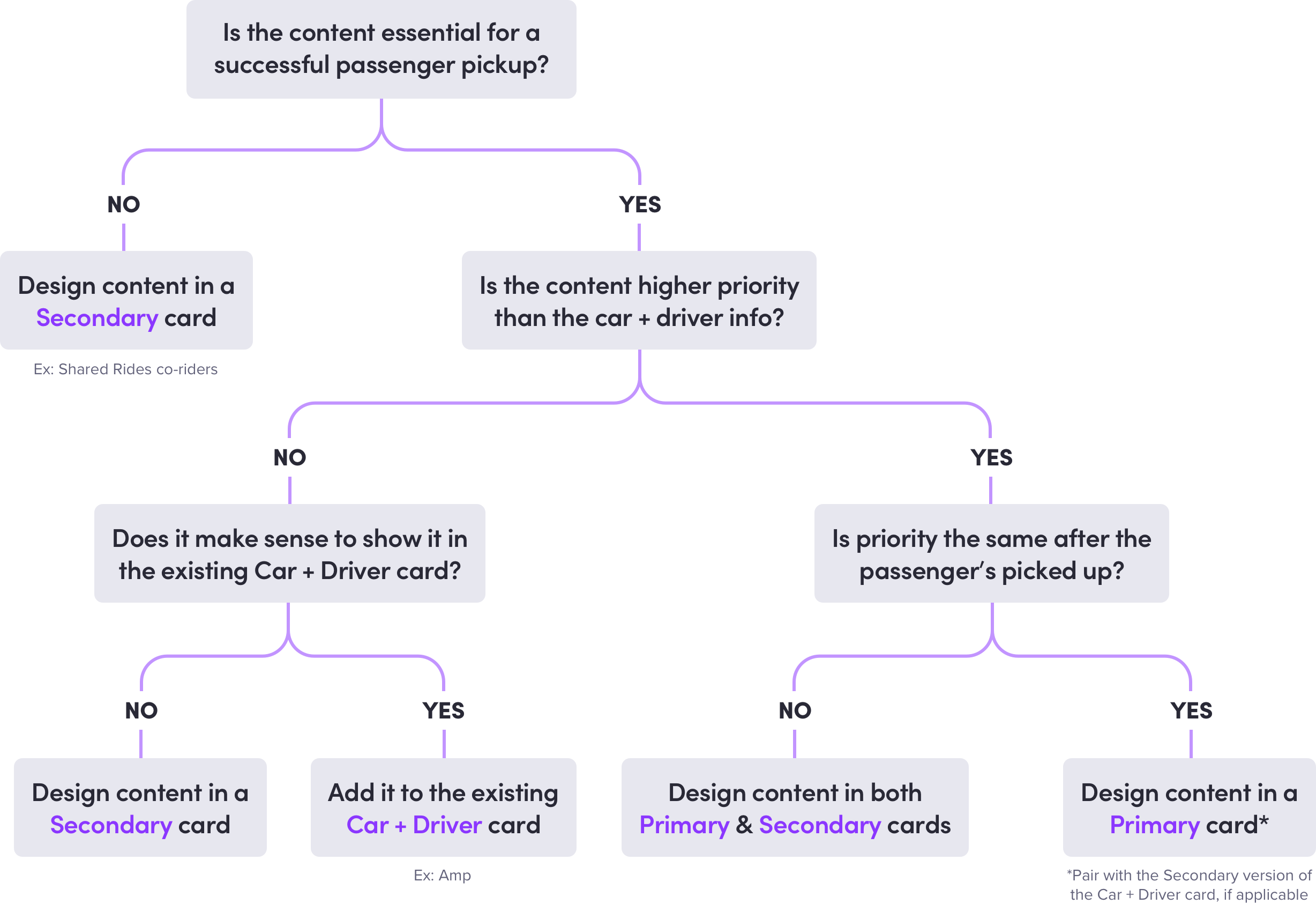
Ex: decision tree to help designers determine where their panel content should live
Ride Actions
Post-request cancels are the most costly for both drivers and Lyft as the driver has invested time, gas and mileage heading to a pickup spot before the rider cancels. Riders are prompted to answer a short post-cancelation survey asking why they canceled the ride. From these survey results, we saw that a statistically significant number of riders were canceling because they were unfamiliar with how to edit their trip details once the request had been made.
In an effort to address these comprehension issues and dissuade riders from canceling after a driver is already on their way, I designed a series of experiments, including this (winning) variant which bundles key ride actions into a bottom sheet.

MY WORK:
Edit ride action sheet, cancel confirmation variants, edit pickup/drop-off/add stop flows
MY TEAMMATES’ WORK:
Send ETA flow, actions for non-Classic Lyft rides, additional cancel friction experiments
Step 5: Find Your Car
Drivers who meet certain requirements are given a dashboard-mounted light-up device, called Amp, which when paired with a driver’s phone will display a color that matches the color riders will see represented in their app. This can be especially useful when riders are waiting to be picked up at a crowded venue and have trouble reading license plates at night.
My goal was to translate this feature into our new design language and increase riders’ comprehension of Amp.
MY WORK:
Amp UX/UI, panel transition, art direction for educational illustration
MY TEAMMATES’ WORK:
Amp illustration

Step 6: Tip your driver
One of our learnings from user research and experimentation was that riders tend to disassociate the act of tipping from how they felt about their overall experience. So even riders who may have not had the most ideal experience (ex: a lot of traffic, drop-off time increased, etc.) were still likely to tip their driver. Due to this finding, another team devoted a significant effort to improving the ratings experience, while our team focused on the tipping experience.
Our team’s goal for the end of 2018 was to increase driver tips by 20% — a goal which we actually exceeded by 1.5%, through a number of iterative improvements. In addition to several small behavioral nudges, I designed a feature that allows riders to add a tip during their ride.

MY WORK:
In-ride tipping flow, post-ride tipping experiments
MY TEAMMATES’ WORK:
In-ride ratings, post-ride tipping & rating experiments

My coworker Finn and me hard at work redesigning the Rider app